The Allure of “Nothing”: A Fresh Perspective on Smartphone Design
Table of Contents
- The Allure of “Nothing”: A Fresh Perspective on Smartphone Design
- Carl Pei’s Vision: More Than Just a Phone
- The OnePlus Legacy: A Foundation for Success
- Design as a Differentiator: More Than Skin Deep
- The Future of Nothing: A Brand Built on Innovation
- The Evolution of Nothing: From Trendsetter to Mainstream Contender
- A Legacy Built on Design and Exclusivity
- The Phone (1): A Bold First Impression
- The Phone (2): Building on Success and Expanding Appeal
- Balancing Performance and Price
- A Subtle Evolution: Battery Life and Design
- Looking Ahead
- The Nothing Phone (2): A Refined Take on Minimalist Design
- A Familiar Yet Refined Aesthetic
- The Evolving Glyph Interface
- Beyond Aesthetics: The Evolving Glyph Interface
- A Premium Design: More Than Just Aesthetics
- Nothing OS 2.0: A Refined User Experience
- A Symphony of Style: The Evolution of Glyph Interface
- Elevating Photography: A Focus on Hardware and Software
- A Commitment to Innovation: Looking Ahead
- Hardware Enhancements: A Step Up from the Original
- Software Refinements: A More Polished Experience
- Is the Phone (2) Worth the Upgrade?
- The Allure of the Midtier Machine: Style Meets Substance
- Finding Value in the Middle Ground
- The Rise of Style-Conscious Tech
- The Future of Midtier Machines
Carl Pei’s Vision: More Than Just a Phone
Carl Pei, the enigmatic founder of Nothing, couldn’t contain his excitement when he spotted a competitor mimicking his brand’s design at MWC. He even took to Twitter, sharing a picture with the phone and expressing his amusement. While some might view imitation as a sign of disrespect, Pei sees it as validation – proof that Nothing is onto something truly special.
Nothing’s entry into the smartphone market has undoubtedly shaken things up. For years, the industry had become stagnant, with manufacturers playing it safe and sales figures reflecting this lack of innovation. But Nothing injected a much-needed dose of excitement, proving that design can be a powerful differentiator in a crowded marketplace.
The OnePlus Legacy: A Foundation for Success
Pei’s previous success with OnePlus, where he cultivated a loyal following by offering high-quality devices at competitive prices, has undoubtedly paved the way for Nothing’s journey. He understands the importance of building a direct connection with customers and fostering a sense of community – something that was instrumental in OnePlus’s early growth.
However, Nothing faces a unique challenge: establishing its own identity while navigating the complexities of a mature market. The question remains: what sets Nothing apart from the established players? The answer lies not just in aesthetics but also in a commitment to transparency and user feedback.
Design as a Differentiator: More Than Skin Deep
Nothing’s design philosophy is centered around simplicity, functionality, and a touch of whimsy. The Phone (1), with its transparent back panel and signature glyph interface, stands out from the sea of generic smartphones. It’s a device that sparks conversation and invites users to explore its unique features.
This focus on design extends beyond the physical product. Nothing’s marketing campaigns are equally innovative, leveraging social media and user-generated content to create a buzz around their brand. They understand that in today’s digital age, aesthetics play a crucial role in shaping consumer perception.
The Future of Nothing: A Brand Built on Innovation
While the smartphone market is fiercely competitive, Nothing has carved out its own niche by embracing a different approach. Their commitment to design, transparency, and user feedback sets them apart from the crowd. As they continue to evolve and introduce new products, it will be fascinating to see how Nothing shapes the future of technology.
For more insights into the world of tech and innovation, visit The Verge.
The Evolution of Nothing: From Trendsetter to Mainstream Contender
A Legacy Built on Design and Exclusivity
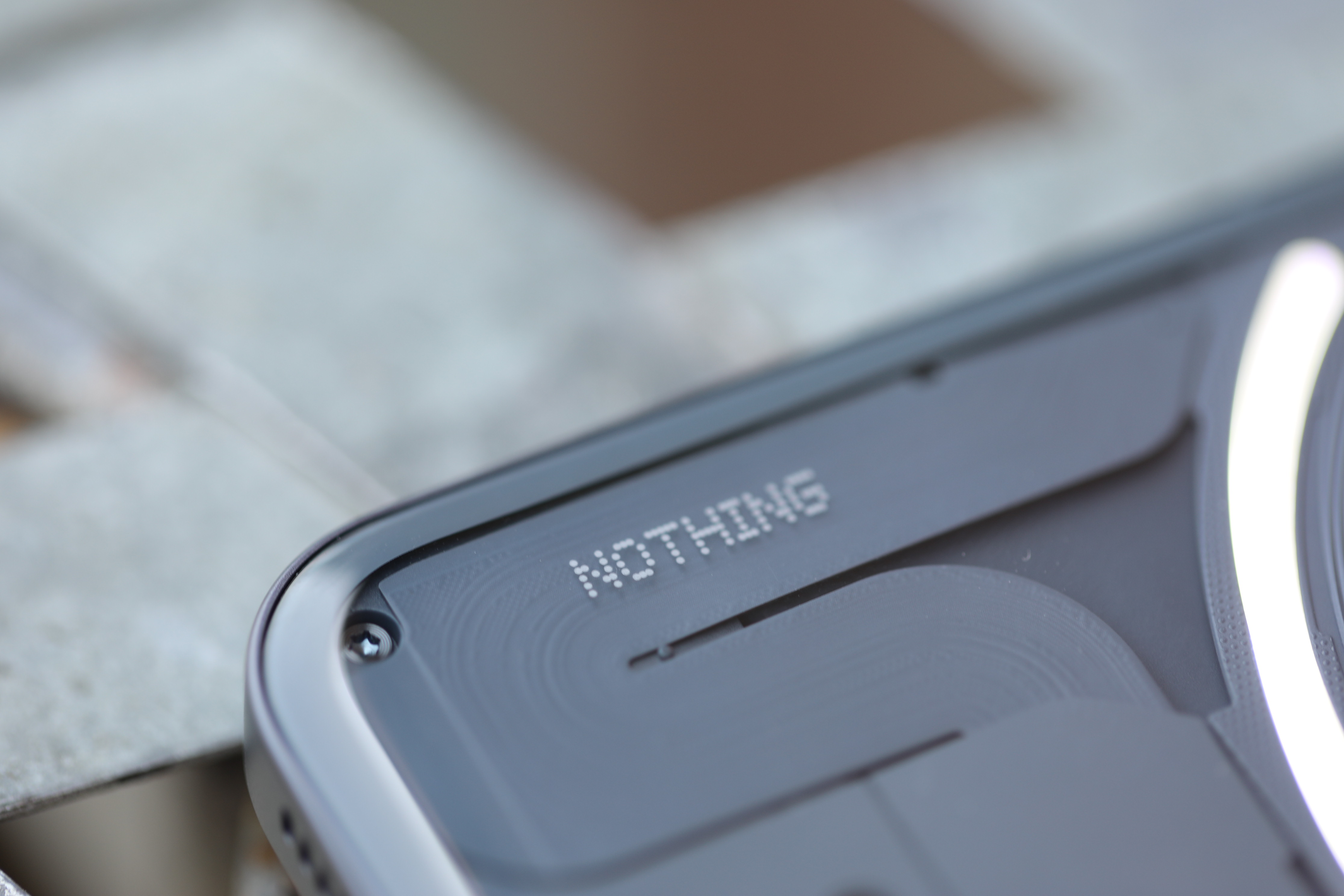
Nothing’s journey in the tech world began with a bang. The Ear (1) earbuds set the stage for the brand’s signature aesthetic: transparent design elements, monochromatic color schemes punctuated by pops of purple, and text stylized like circuit board etchings. This industrial yet approachable look quickly became synonymous with Nothing, establishing them as more than just another tech company – they were a statement.
Their marketing strategy cleverly borrowed from the worlds of fashion and sneakers. Limited-edition product releases, exclusive pop-up shops, and even their first retail store in London fueled hype and created a sense of exclusivity around their products. This approach resonated with consumers seeking something unique and desirable, much like limited-edition streetwear.
The Phone (1): A Bold First Impression
The Nothing Phone (1) was tasked with making a lasting impression in the crowded smartphone market. While it wasn’t a revolutionary device in terms of specifications – featuring the mid-tier Qualcomm Snapdragon 778G+ chip – its standout feature, the illuminated glyph design on the back, captured attention and sparked conversations.
The Phone (1) successfully positioned Nothing as a brand that prioritized design and aesthetics over raw power. It aimed to be more than just a functional device; it aspired to be a status symbol, a piece of tech you’d proudly display. This strategy resonated with consumers who valued style and individuality in their gadgets.
The Phone (2): Building on Success and Expanding Appeal
With the success of the Phone (1), the Nothing Phone (2) faces a new challenge: proving that they are more than just a one-hit wonder. Smartphones are inherently iterative products, with advancements often incremental rather than revolutionary. The Phone (2) needs to go beyond novelty and offer tangible improvements to solidify its position in the market.
This means focusing on areas like camera performance, software optimization, and battery life – features that directly impact user experience. The Nothing team has likely taken feedback from the initial release into account, refining the device to address any shortcomings and cater to a wider range of consumers.

Image Credit: Brian Heater
The Nothing Phone (2) represents a crucial step in the brand’s evolution. It’s an opportunity to build on their initial success, refine their formula, and establish themselves as a serious contender in the smartphone market.
The Nothing Phone (2): A Refined Take on Affordability
Balancing Performance and Price
Nothing’s strategy with the Phone (2) is clear: deliver flagship-level performance without the exorbitant price tag. While it might not boast the absolute latest Qualcomm Snapdragon 8 Gen 2 chip, opting instead for the powerful Snapdragon 8+ Gen 1, the company cleverly avoids hitting those premium price points that often deter budget-conscious consumers. This approach echoes OnePlus’s successful strategy of offering high-quality devices at competitive prices. The Phone (2) starts at $599, positioning it as a compelling alternative to more expensive flagships.
This pricing strategy allows Nothing to target a broader audience, particularly those seeking value for their money. While the company’s scale might not yet rival industry giants, its commitment to affordability could be a key differentiator in attracting new customers. As Nothing scales up production and distribution, we can expect prices to potentially drop further, making the Phone (2) even more accessible.
A Subtle Evolution: Battery Life and Design
Beyond the processor choice, the Phone (2) sees several subtle but significant improvements. The battery capacity has been bumped up from 4,500 mAh to 4,700 mAh, promising slightly longer usage times. This increase, coupled with the more efficient Snapdragon 8+ Gen 1 chip, should result in a noticeable boost in battery life.
The phone’s dimensions have also grown slightly, measuring 162.1 x 76.4 x 8.6 mm compared to the original Phone’s 159.2 x 75.8 x 8.3 mm. This expansion likely accommodates the larger battery and contributes to a more comfortable grip.

Image Credit: Brian Heater
Looking Ahead
The Nothing Phone (2) represents a refined approach to affordability in the smartphone market. By prioritizing performance and value, Nothing aims to carve out its own niche and attract consumers seeking a compelling alternative to established brands. As the company continues to grow and innovate, we can expect even more exciting developments from Nothing in the future.
The Nothing Phone (2): A Refined Take on Minimalist Design
The Nothing Phone (2) arrives with subtle yet significant upgrades over its predecessor. While the design language remains largely unchanged, a few key improvements elevate this iteration to new heights. The most notable change is the slightly larger display, expanding from 6.55 inches to 6.7 inches. This increase in screen real estate also brings a bump in resolution, now at 2412 x 1080 compared to the previous 2400 x 1080. While these changes might seem minor on paper, they contribute to a more immersive and visually appealing experience.
A Familiar Yet Refined Aesthetic
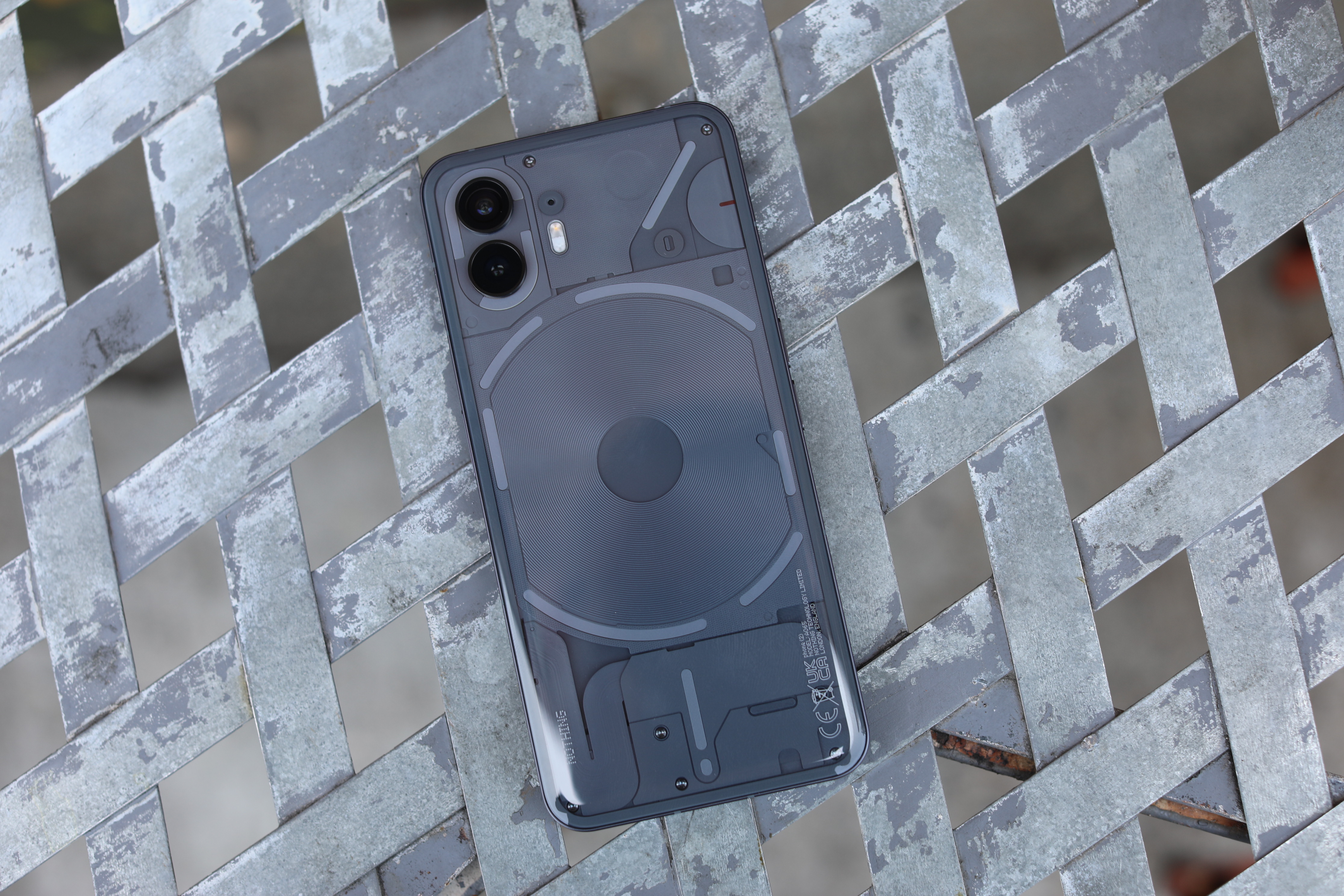
The Nothing Phone (2) continues to embrace its minimalist design philosophy, drawing inspiration from the iconic iPhone aesthetic. At first glance, it’s easy to mistake it for an Apple device, highlighting Carl Pei’s admiration for Apple’s design language. However, the rear of the phone is where things get truly interesting.

Picture Credit: Nothing
The Evolving Glyph Interface
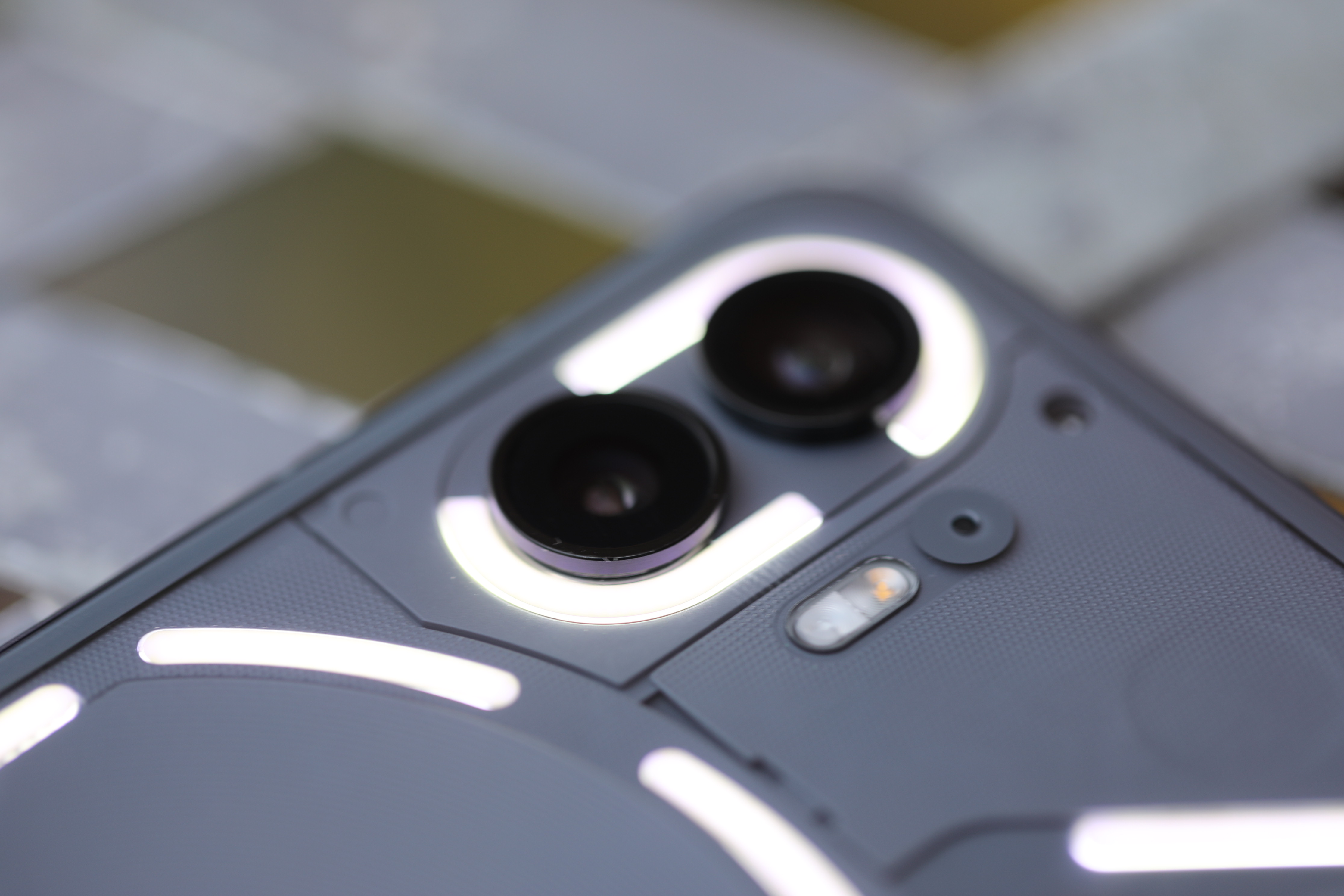
The Glyph interface, a defining feature of the Nothing Phone (1), has been significantly enhanced in the Phone (2). With 33 individual LEDs, it offers a more dynamic and customizable experience. This allows for a wider range of notifications, alerts, and even interactive light shows. The expanded Glyph system adds a unique layer of personalization and functionality to the phone.
Carl Pei’s perspective on foldable phones aligns with this approach. He believes that technology advancements often drive innovation rather than genuine user needs. He argues that companies prioritize profit margins by pushing new technologies, even if they lack practical value for consumers. This viewpoint suggests that Nothing is focused on refining existing features and delivering a polished user experience rather than chasing fleeting trends.

Picture Credit: Brian Heater
The Nothing Phone (2) continues the brand’s exploration of a unique design language that blends form and function. While its predecessor, the Nothing Phone (1), garnered attention for its distinctive Glyph Interface, the Phone (2) refines this concept and introduces subtle yet impactful changes.
Beyond Aesthetics: The Evolving Glyph Interface
![]()
Picture Credit: Brian Heater
The Glyph Interface on the Nothing Phone (2) has evolved significantly. With nearly three times the LED zones compared to its predecessor, it offers a more dynamic and versatile experience. While it’s still primarily used for notifications and charging indicators, developers are now exploring its potential for creative applications, such as interactive games or personalized light shows.
The Nothing Phone (2) features a subtle yet impactful design change: the transition from a flush rear to curved and rounded glass. This seemingly minor alteration elevates the phone’s aesthetic appeal and enhances its tactile feel, making it more comfortable to hold and use.
Nothing OS 2.0: A Refined User Experience
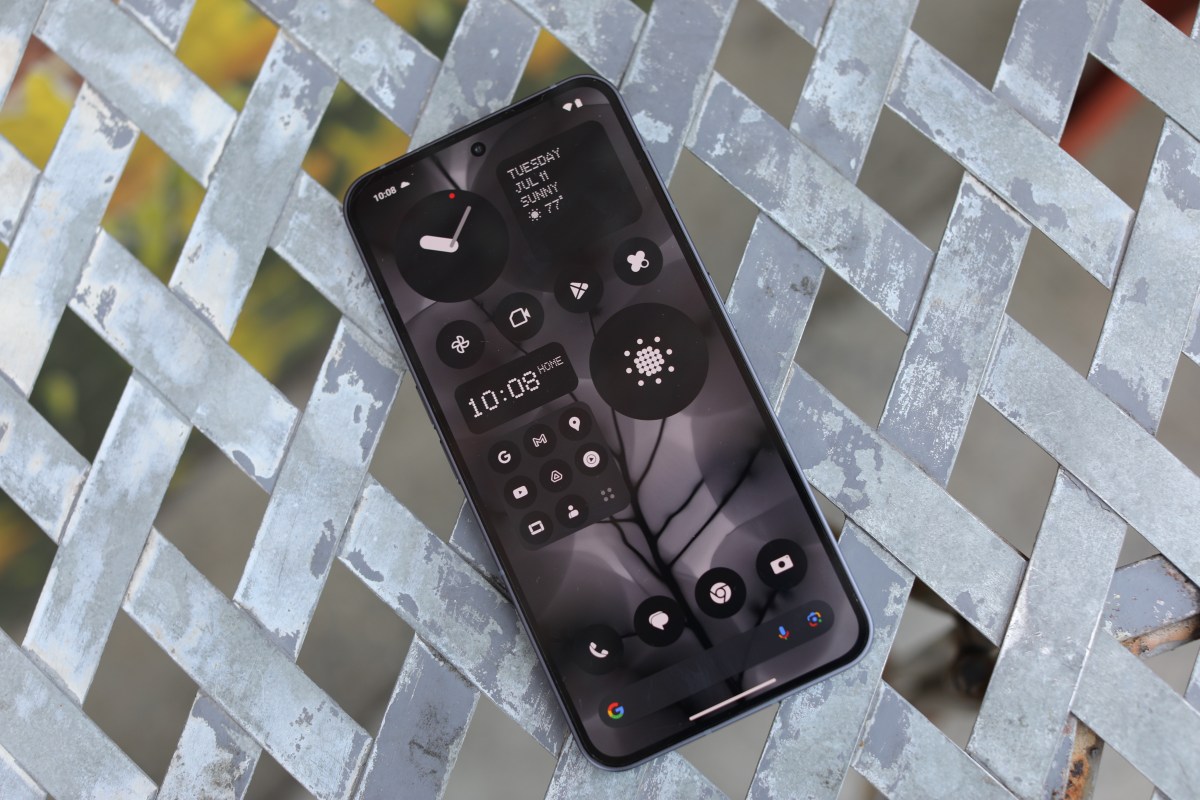
The Nothing Phone (2) runs on Nothing OS 2.0, a customized version of Android 13 that retains the brand’s signature minimalist aesthetic. The monochromatic interface is punctuated by occasional pops of purple, which are used to highlight elements like text, numbers, and even graphics within apps. This unique visual language creates a cohesive and visually appealing user experience.
The Nothing Phone (2) demonstrates a commitment to continuous improvement and innovation. By refining the Glyph Interface, enhancing the design, and delivering a refined software experience, Nothing continues to carve its niche in the smartphone market.
Nothing Phone (2): A Deeper Dive into Design and Features
The Nothing Phone (2) has arrived, bringing with it a refined design language and some intriguing new features. While the signature glyph interface remains a key highlight, Nothing has also made significant strides in other areas, particularly in terms of visual aesthetics and camera technology.
A Symphony of Style: The Evolution of Glyph Interface
One of the most striking aspects of the Phone (2) is its commitment to design consistency. The glyph interface, a grid of LED lights on the back of the phone that can be customized for notifications and other functions, has been further refined. This time around, Nothing has opted for a more minimalist approach, with a sleeker arrangement of LEDs that seamlessly integrate into the overall design.
This attention to detail extends beyond the glyph interface itself. The Phone (2) boasts a range of color options, each carefully curated to complement the phone’s unique aesthetic. Whether you prefer a classic black or a vibrant blue, there’s a Nothing Phone (2) that’s sure to match your style.
Elevating Photography: A Focus on Hardware and Software
Nothing has also made significant strides in the camera department. The Phone (2) retains its dual-camera setup, featuring a pair of 50-megapixel sensors. However, the primary sensor has been upgraded from the Sony IMX766 to the more advanced IMX890. This upgrade promises improved image quality, particularly in low-light conditions.
Beyond hardware improvements, Nothing is also investing heavily in software optimization. The company’s camera app features a range of intuitive controls and shooting modes, allowing users to capture stunning photos and videos with ease.
A Commitment to Innovation: Looking Ahead
The Nothing Phone (2) represents a significant step forward for the brand. With its refined design language, powerful hardware, and commitment to software innovation, it’s clear that Nothing is serious about challenging the status quo in the smartphone market.
As the company continues to grow and evolve, we can expect to see even more exciting innovations from Nothing in the years to come.
Nothing Phone (2) Review: A Solid Midtier Upgrade

The Nothing Phone (2) builds upon its predecessor’s foundation, refining the user experience with hardware enhancements and software improvements. While it doesn’t quite dethrone Google’s dominance in the mid-tier market, it offers a compelling alternative for those seeking a unique design and solid performance.
Hardware Enhancements: A Step Up from the Original
The Phone (2) boasts several notable upgrades over its predecessor. The rear camera system now features a 50MP main sensor paired with a 50MP ultrawide lens, promising improved image quality and versatility. The processor has also been upgraded for smoother performance and better multitasking capabilities.
However, the most striking feature remains the iconic Glyph Interface on the back. This customizable LED panel can be programmed to light up in various patterns for notifications, charging status, or even as a makeshift flashlight. It’s a unique design element that sets the Nothing Phone (2) apart from the competition.
Software Refinements: A More Polished Experience
Nothing has also focused on refining the software experience with the Phone (2). The user interface is more intuitive and responsive, and the company has added several new features to enhance productivity and customization.
The Nothing OS, built upon Android 13, offers a clean and bloatware-free experience. It’s also highly customizable, allowing users to personalize their phone’s look and feel to their liking.
Is the Phone (2) Worth the Upgrade?
While the Nothing Phone (2) is a solid midtier device with several improvements over its predecessor, it’s not a significant enough leap to justify an upgrade for existing Phone (1) owners. The price increase of £399 ($460) might be too steep for those who are satisfied with their current phone.
However, for new buyers looking for a unique and stylish phone with solid performance and a clean software experience, the Nothing Phone (2) is definitely worth considering. It offers a compelling alternative to the more mainstream options in the market.
The Allure of the Midtier Machine: Style Meets Substance

In the ever-evolving landscape of technology, where innovation often takes center stage, there’s a quiet appeal to the “midtier machine.” While groundbreaking advancements capture headlines, these devices offer a compelling blend of functionality and aesthetics without breaking the bank.
Finding Value in the Middle Ground
The midtier market represents a sweet spot for consumers seeking a balance between performance and affordability. It’s not about pushing the boundaries of what’s possible, but rather delivering a reliable and stylish experience that meets everyday needs. Think of it like choosing a well-tailored suit – it doesn’t need to be the most extravagant design, but it should fit perfectly and exude confidence.
Consider the example of a midtier smartphone. It might not boast the latest camera technology or the fastest processor, but it will likely offer a smooth user experience, a vibrant display, and a sleek design that complements your style. This approach resonates with consumers who prioritize practicality and value over chasing the newest features.
The Rise of Style-Conscious Tech
Interestingly, the midtier machine is increasingly gaining recognition for its aesthetic appeal. Gone are the days when functionality reigned supreme; today’s consumers expect their devices to be visually pleasing as well. Manufacturers are responding by incorporating design elements that elevate these machines beyond mere tools.
Take, for instance, the resurgence of retro-inspired designs in laptops and headphones. These products seamlessly blend classic aesthetics with modern technology, appealing to a generation that values both functionality and nostalgia. This trend highlights how style is becoming an integral part of the tech experience.
The Future of Midtier Machines
As technology continues to advance, the midtier machine will likely evolve further, offering even more compelling features and designs. We can expect to see increased emphasis on sustainability, with manufacturers using recycled materials and implementing energy-efficient technologies.
Moreover, the rise of artificial intelligence (AI) could lead to personalized experiences within midtier devices, tailoring functionality and recommendations to individual user preferences. This evolution will ensure that the midtier machine remains a relevant and desirable option for consumers seeking a balance between style, substance, and affordability.


